Crimsoncover
April 18, 2011
So, I was hired earlier this year to do the formatting and cover for the book War Plan Crimson by Michael Cnudde (Somerset House Press). It's taken a little longer than intended, but I've finally got the formatting done, and now it's time to finish the cover.
Mike had a specific idea of what he wanted for the cover, which helps a lot in narrowing down the possibilities. He wanted a greyscale photomanipulation of "the Peace Tower surrounded by billowing smoke (Think of the famous photo of the dome of St. Paul's Cathedral in London during the Battle of Britain.) An American flag is flying from the top of the tower."
Now, I haven't done any extensive photomanipulation in the last few years, but I figure it's like riding a bike, right? Err...
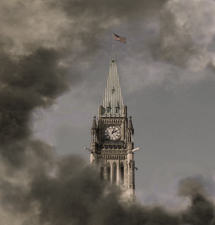
This was the first (very rough) draft. I threw it together in about an hour to give him some idea what the final product might look like. It took an hour because I spent most of that time trying to re-familiarize myself with the actual photomanipulation aspects of Photoshop; remembering that the clonestamp is my friend. Needless to say, it sucks. The foreground doesn't fit with the background at all, and the light on the tower is very obviously coming from the direction of the smoke clouds.
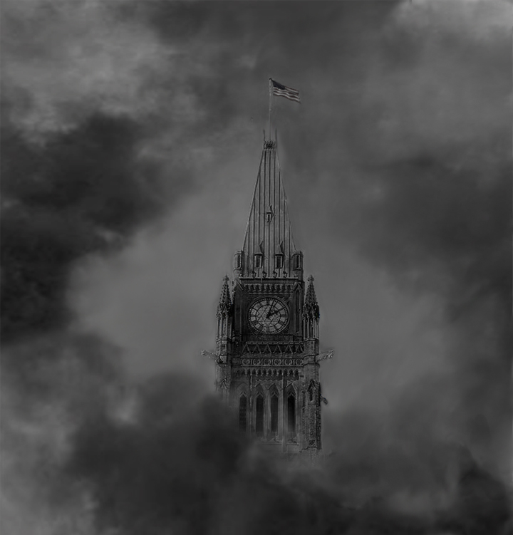
Desaturated, more smoke, less obvious light, and a little bit of blending with the background. This is a little more what Mike had in mind, but it's not perfect by any means, and certainly not good enough for me. It still looks disjointed, it's too dark, and there are these blurry spots and light patches on and around the tower from where I was trying to burn and dodge and blend. In addition, there's a little too much detail on the tower in comparison with the clouds.
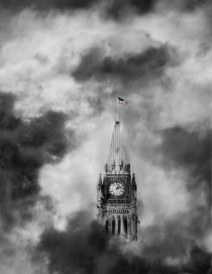
This is about the final product. I'll still do some touch-ups, but I'm a lot more happy with it than the previous versions. Mike wanted it to be similar to this picture, which, until now, I really hadn't attempted in the slightest. So, I increased the contrast by a lot and lightened it up. There are now clouds in the background, a little less detail on the tower, and it's tall enough to be a full cover.
Now I need to figure out the best placement for the author's name and title...
Mike had a specific idea of what he wanted for the cover, which helps a lot in narrowing down the possibilities. He wanted a greyscale photomanipulation of "the Peace Tower surrounded by billowing smoke (Think of the famous photo of the dome of St. Paul's Cathedral in London during the Battle of Britain.) An American flag is flying from the top of the tower."
Now, I haven't done any extensive photomanipulation in the last few years, but I figure it's like riding a bike, right? Err...
This was the first (very rough) draft. I threw it together in about an hour to give him some idea what the final product might look like. It took an hour because I spent most of that time trying to re-familiarize myself with the actual photomanipulation aspects of Photoshop; remembering that the clonestamp is my friend. Needless to say, it sucks. The foreground doesn't fit with the background at all, and the light on the tower is very obviously coming from the direction of the smoke clouds.
Desaturated, more smoke, less obvious light, and a little bit of blending with the background. This is a little more what Mike had in mind, but it's not perfect by any means, and certainly not good enough for me. It still looks disjointed, it's too dark, and there are these blurry spots and light patches on and around the tower from where I was trying to burn and dodge and blend. In addition, there's a little too much detail on the tower in comparison with the clouds.
This is about the final product. I'll still do some touch-ups, but I'm a lot more happy with it than the previous versions. Mike wanted it to be similar to this picture, which, until now, I really hadn't attempted in the slightest. So, I increased the contrast by a lot and lightened it up. There are now clouds in the background, a little less detail on the tower, and it's tall enough to be a full cover.
Now I need to figure out the best placement for the author's name and title...
Posted by Tristan Tinder. Posted In : stages
